
Running of the Bulls
I suppose I was in a red kind of mood this NSD weekend, because all of these layouts have touches of red! Also, all of them were created for various Studio Calico challenges. The DT prompted a TON of inspiration. These three layouts were inspired by 9 different challenges. I'll break it down for you now.
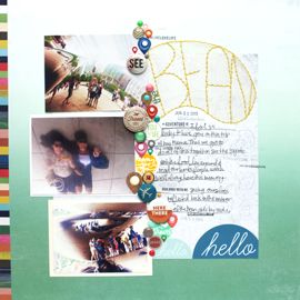
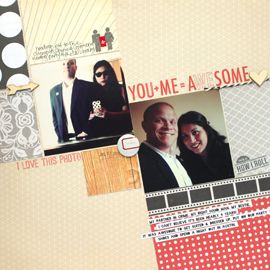
This page was created for the mist, lift yourself, and scrap an old photo challenges. I lifted my Hair layout but switched things around a bit. The mist is the same but the awesome Prima star element ended up horizontal instead. Also, used those amazing yellow Basic Grey letter stickers. Seriously, there's like a million letters on there bc I'm nowhere near to running out! And I've used them, a lot! I bought the red Max and Whiskers version because of this.
About the photo, it's an oldie. Back from 2006 when I was studying abroad in Spain. As luck would have it, the last weekend of our program was the last weekend of the running of the bulls. Also as luck would have it, the city I lived in was only a 2 hour bus ride away from Pamplona! How could we not go? Being the mother hen that Professor Cassidy is, she arranged the whole thing for us. All we all had to do was stumble on the bus at around 4 am and stumble through the dirty streets of Pamplona to our balcony around 6. Seriously, the most memorable experience!

Mama
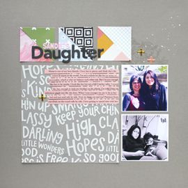
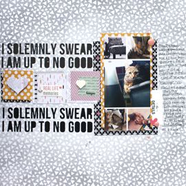
Awww, mama. I love her :) She's my bestie! This layout was created with inspiration from the ad challenge, mist challenge, scrap yo mama challenge and I used another older photo. I feel like I look so young! It was taken at Nana's house early 2006. I think we were just over that day and I think I just felt like taking a picture of us. Who knows why I took this, but I'm happy I did because I'm so surprised that she actually smiled! She never smiles! And who knew that four eyes could make the two of us look alike. I resemble my mama, but not very much.

The Sweetest Pair
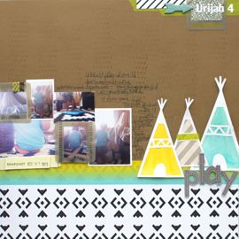
The last of my NSD weekend creations! And arguably the worst :( I'm just not really feeling it. It feels too flat. But that's what I get for using this gorgeous Sassafras paper. It did all of the work. I attempted to add dimension with the banners and the flower, but they feel a little off. I do like the idea for it though.
This ones good for the sketch, layered flower and scrap your opposite challenges. I made the flower from memory. I read a tutorial somewhere around the blogosphere. If you know where it was please let me know! But it's three layers; the folded green outer edge, the white scalloped punch and the clear green button. Loving these flowers!
I definitely say this is my opposite style. I rarely scrap 4x6 photos, and not very often a single one on a 12x12 page. It has a patterned paper background and not a lot of cardstock. Maybe the reason I don't like it, is because it's so much my opposite. At least this photo's done!
Happy National Scrapbook Day!!
j.leija


No Comments Yet, Leave Yours!