Who's Who: Book Journal

Friday, February 25, 2011

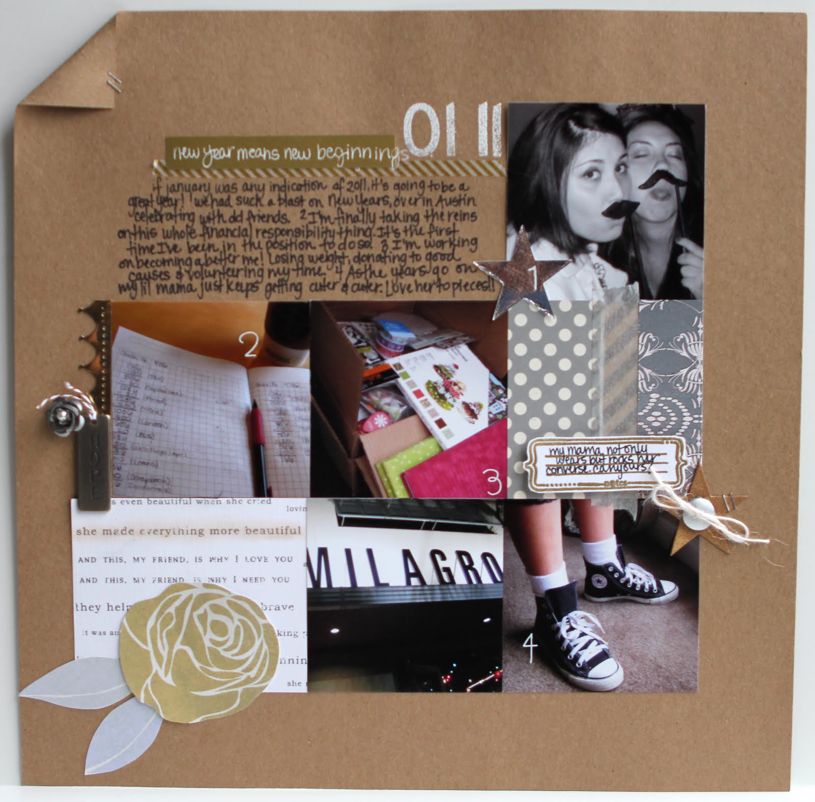
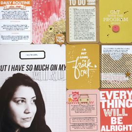
I was so inspired by the book theme in January's Who's Who SC kit, that I put together this altered journal.

I like to take notes when I read, keep quotes and record little tidbits that sound pleasing to the ear. That's what this little journal is for. It's tiny, compact and portable. I love that I can throw it in my purse along with my book.

I tore up the Hoopla Paper Layers from the Dear Abby add-on and decoupaged them onto a cardstock base, with bits of that truly gorgeous sheet of Curio (Basic Grey) patterned paper sprinkled in. Then, I used the stamp from the main kit to add some books for the theme and some green distress ink to add some depth to the design.

I covered the entire book with UTEE which gave it its' shiny sheen. Then, added some book tape (from Paper Source) but it's more for show than function. It doesn't really like the UTEE (it doesn't stick very well) but I like the book effect it adds.

I finished it off with a 3D kite from Martha's spring collection. It was just too perfect! And for the inside, I used the opposite side of the Curio patterned paper for end papers.
I made this for recording my notes for my book reviews. Now I definitely don't have an excuse to procrastinate this one ;) Thanks for stopping by!

xxbesos

Project 12: January

Tuesday, February 22, 2011

The very lovely Ki Memories Sew Cute calendar pages inspired me to tackle Project 12. I want an entire year documented, especially this one, my first year as a post grad professional.

I ordered all 12 calendars and picked this lovely white and gray one for January. I have no idea why but I immediately thought of metallics for this project. I thought they'd be pretty with the white and gray. Seems I've been drawn to neutral metallics lately, in more than just my scrapbooking.

I guess stars were a secondary theme. For no other reason other than that stars are typically done in metallic colors as well. I cut these using scraps and a die from Papertrey Ink. Then just added bits of paper, masking tape, did some stamping and some masking with spray ink.

Along with my calendar, I wanted to do an additional 12 x 12 page with photos from the month. This month, I was fairly light on photos. I'm still getting into the habit of taking everyday type photos.

I continued the neutral kraft, silver, gray, gold, white theme on this page as well. And just added bits and pieces here in there. I decided to staple down the corner of the layout, as symbolism for a new year and the idea of turning the page on the book of your life.

I loved this metallic cluster, with the gorgeous silver rose brad (Dear Lizzy, American Crafts) and the id tag (Tim Holtz), with the mirror paper punched with a Martha Stewart border punch.
And this is by far and away my favorite photo from the month. My lil mama is just too adorable! She's like an over grown kiddo with her high top Converse that were hand-me-downs from my 15 year old cousin, Emily. Why does everything tiny always look so much cuter?!

So yeah, a bit late in coming but better late than never! I might get February's done early...or late. We shall see. Until then, happy scrapping!

xxbesos

U Make Me Happy

Sunday, February 20, 2011

A quick and simple page of my favorite little man. He just couldn't be any more adorable. He was seriously hamming it up for me this day.

I've had these photos for awhile. So the other day when I went into Archivers and saw these amazing American Crafts papers, I knew immediately that I wanted to use them and that I wanted the theme to be the other half of the "You are my sunshine" song. I think it's the underrated part of that song, but still so good!

95% of the page is using American Crafts products (they're too awesome!) and the stamps are Studio Calico. Just have to point out that I'll probably never regret buying SC letter stamps. They're just so versatile! And also that cloud paper featured in the middle. It's the cutest cloud pattern I've seen! And believe me, there's a plenty of cloud patterns out there.

Oh also, I'm not sure that the picture conveys this, but I pop dotted just the two photos of Urijah. I love that he pops off the page :)

Thanks for stopping by!

xxbesos

No. 143-Asia Wall

Saturday, February 19, 2011

Hi, hello!! I'm back on this glorious Saturday, to share with you another bit of my apartment. This little project of mine is slowly coming together.

I love how this photo captures 2 walls of my apartment (and the BF for your viewing pleasure ;) both of which feature the decor theme, travel.

This particular wall is China themed and the first thing I see when I walk into my apartment.

I lived in Asia for 4 months, at the end of 2008, and I was fortunate enough to travel to many different countries during that time. China was by far and away the country that had the most impact on me. I've never felt more embraced by a country or it's people. One of these days, I'll get around to sharing more of my lovely stories. But for now, I'll just stick with the eye candy.

The wall features a few treasures I picked up during my travels.
  1. Books: the whole reason for my visit to China, was for research into my thesis (financing the Chinese healthcare system). So naturally, I had to do some initial research on the PRC. I picked up a few books, both fiction and non, to help me get a better feel for the country. I think they're gorgeous in and of themselves. The floating shelf I used was just wide enough to accommodate a few, as well as my tiny collection of clear glass vases and bottles.
  2. Scarf: while I was in China, I visited the Forbidden Palace. It was an enthralling experience, let me tell you. Naturally, I wanted to bring home something special to remember it by, so I purchased 2 scarves (1 for me, 1 for Mama). They've been sitting in plastic for 2 years, until I finally was able to pull one out to showcase it here. Thank you IKEA for having such an oddly shaped frame! It's so hard to find square frames in sizes larger than 12x12. I also picked up a little aloe (we think) plant from there. I love the touch of green it adds...and the fact that I only have to water it once a week!
  3. Paper Doilies: We were in Shanghai for a few days and I came across these lovely paper doilies. I loved the bright red color and the delicate designs. And when I say delicate, I mean delicate!! I backed them with tan cardstock and framed them in 12x12 scrapbook frames.
  4. Framed Photo: The Great Wall. Oh man, is that thing great. We got up close and personal with 6 k of it the day we decided to hike it. It seriously kicked my butt but I wouldn't have traded the experience for anything. And look what my little point and shoot turned out. I'm very proud of you point and shoot, almost didn't think you had it in you.
Thus concludes this week's tour of No. 143. Thanks for stopping by!

xxbesos

Across Generations

Thursday, February 17, 2011

Holy technique Batman! I went to town on this background page and created a mini work of art. The prompt for which came from this month's Paperclipping Community, Monthly Challenges. The challenge was to use heat embossing on a project.
Here are my design thoughts:
  • I wanted to create something green and lush, much like my Grandpa's garden. I used a Tim Holtz stamp and 4 different green/gold/teal embossing powders to achieve the background effect.
  • Then, seeing that the stamped images were a bit disjointed, I hit it with 2 shades of green Maya Mist, to create a more cohesive background.
  • It's a busier background that what I traditionally use but I think that's ok. I really think it makes my Grandpa, in his blue shirt, and my nephew Urijah pop off the page.
  • I went for a very linear, very simple photo arrangement because there was already a lot going on.
  • In adding journaling, I wanted it to not carry as much visual weight and wanted it to blend into the background a bit more. So I printed it out on a transparency.
  • Embellishing was the hardest part! I didn't want to add too much, but also knew it needed something more. The orange "tag" pieces are what I came up with. I stamped and hand wrote a few sentiments on orange cardstock, and using pinking shears, added a decorative border to the top. The bottom piece really conveyed "garden" to me, since I used Tim Holtz's metal memo pins like a plant marker (can't think of what they're called!!)
  • The final touches were Martha Stewart's adhesive backed ribbon along the bottom edge and against the side of the focal photo.
I love these photos. I love seeing my grand parents with their great-grand baby. I love seeing them in their garden. It's my Popo's pride and joy. I can't not think of him in this garden.

I love seeing these two guys next to each other, in their matching cut off shirts. It makes me smile. That's 4 generations right there. How can you not love that?!

xxbesos

New Years Pages

Tuesday, February 15, 2011

This one is for you T$!! Hehehehe!!


This is my best friend Tara. I love her and miss her to death! (She lives in Austin.)

That is a signature Tara move. It can mean 1 of 2 things. She's either really happy, or really mad. It needed to be documented :)

I used Shimelle's 4x6 Photo Love class as the basis for the page and streamed red, white and black butterflies across the page. It turned out to be one of Matt's favorite layouts. He says, because it's simple.

I like it too :)

This is a scraplift from the Studio Calico gallery, from the lovely simplytam.

The pink + metallics makes for a chic girly page. In my opinion at least.

You have to take the "pretty" picture before a big night out.

But honestly, the candid ones are my favorites.

xxbesos

Sweet Valentine

Monday, February 14, 2011

Sweet Valentine...dum dum dum...how you've always made me feel so good. So good! So good!!

Not so sure if that's exactly how the words to Sweet Caroline go, but it's something like that I'm sure.

Just wanted to share the card I made for my sweetheart. Lots of misting, inking, and heat embossing on this one. Oh, and I used my new border punch!

Happy Valentine's Day yall!!

xxbesos

Candy Shoppe: Sunshine

Sunday, February 13, 2011

Finally, a Urijah page! It's been awhile since I've scrapped my favorite little man. But I'm bound and determined to finish all of his Year 1 pages, before his 2nd birthday in April. I'm hoping I make it!
I put my recently arrived Studio Calico kit, Candy Shoppe, straight to work. The exclusive SC/Crate Paper patterned paper was just too gorgeous to pass up. And I thought it'd be a perfect theme for my page about sunshine.

I love all of the color in this, which is why I chose to print in black and white. And yes, pink is a "girl" color. But I'm not too bothered. I think it makes the page fun!

Oh Urijah, he's such a beautiful little boy, with his big almond eyes and hill billy smile. I love him to pieces!

xxbesos

No. 143-Couch Art

Saturday, February 5, 2011


Back for another installment of No. 143! Today, we’re exploring the living room. When I first moved into my apartment, I knew I wanted a gray couch and we found this lovely number at West Elm, for way cheap! Or at least a whole heck of a lot cheaper than the majority of the places we visited.

I was very particular about the gray. I didn’t want it to be too light, I wanted a gray with a lot of blue in it. I was also very picky about the shape. I hate rounded armrests and dislike couch skirts. I just wanted plain lines. We must have visited 4 stores and seen 40+ couches before we found this one. So so happy we did!
For art, I knew I wanted a larger piece to hang over the couch. And travel is pretty much the theme of my apartment. So when we were walking around IKEA, a wall installation they had really spoke to me. It was a black canvas, with white outlines of the world’s map, and about 5 clocks. It looked easy enough to duplicate and this is what I came up with.

I hand painted the map using white acrylic paint. Masked off the boxes for the labels using tape and letter stickers and then stamped the “so many places, so little time...” directly onto the canvas. I really love how it turned out!

I featured my three “homes” with cheapo IKEA clocks. It’s crazy and still surreal to me that I actually lived as far away from home as I did. They’re literally worlds away. This kind of art is my favorite, it’s very personal to me. I suppose that’s also why I love scrapbooking as much as I do.
The project cost under $100 to make and considering the deeply personal meaning behind it, it’s definitely money well spent.

xxbesos

More Austria Pages

Friday, February 4, 2011


And just like that, one country is complete! This new system I started, obviously works for me. What I did differently, was print out 4 months worth of photos to scrap. Well, at least the country ones. Any of my other pages, I’m printing at here at home.
I wanted to do a page about the loveliness of the little ski town we stayed in, Kirchberg. It was so named for the city's green steepled Church. "Kirche" is German for church, or at least according to the online translator I used.

Brown was the theme color, but I wanted to warm it up with some orange, purple and cream. It was a tad more simple until I stamped that awesome floral in various places around the page. Then, jazzed them up with pearls and ink.

And of course I had to do a page about me actually snowboarding, the whole purpose of the trip! As my journaling says, I'm so no the outdoorsy adventurey type, but my friend Monica is very convincing. I had fun falling down the mountain, but realized snowboarding just isn't for me. Wouldn't have trade the experience for the world though!

1 country down, 20 some to go. I'm whittling away! This month's country is Norway. Stay tuned...

xxbesos