**Giveaway & promo closed but comments still open**
I've been a fan of Ashley's designs for awhile now (see other projects here). So it was super easy to integrate her fantastic cut files into my pages this month.
For this hop, I'm sharing a double page layout featuring the Geometric Graffiti background. The layout is about my neighborhood in Bangkok.
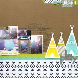
I have a single feature photo on one page. And this is where I incorporated the cut and nearly all of the papers from the June Have a Little Fun Today kit and You are Here add on.
The cut makes it look really complex but it's actually a really simple page. Just the photo, title, patterned paper filled cut and one flair badge (I love! More flair badges in SBC kits, please!)
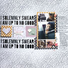
This second page is equally as simple and that was totally intentional. There's so much to see in the photos, that I didn't want to distract from them. I added in a die cut here and there as well as a label where I stamped the date.
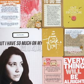
There was so much going on in the photos and with that cut file, I wasn't sure where to include my journaling. So instead of over complicating the design, I just added a pock page insert. That's where I added more embellishments, like a few of the die cuts from the Pink Paislee Atlas ephemera pack and that great silver airplane vellum in the Main kit.
I added two additional photos that I hadn't had room for before the pocket page, as well as my journaling.
That second pocket has two die cuts back to back that I stapled just at the top. I like that it's kind of floating there and that you can see what's behind it.
The bottom pocket is where I added the vellum. I love playing with transparency and vellum is an awesome way to do that.
Journaling Reads:
"I went back to visit MT in Bangkok after I left. I'm so glad I managed to take pictures of the old neighborhood and the streets we walked every day. Our apartments were at Sitara Place which is in the Ratchadapisek (Ratchada) part of Bangkok, just off Soi 3 (Saam). It was a nice "suburb" with lots of modernization. We were in between two sets of malls, the Boma (or Bowling Mall) and the Tema (or Tesco Mall as we dubbed them). Every day we'd get up and walk (or take the apartment Tuk tuk) to the metro station in front of the Tema. On the weekends, we'd head to the Boma for food or massages or other entertainment. Walking the streets you'd see lots of concrete and garages, Thai flags and the King's flag, mini temples with offerings. And it wouldn't be Thailand without a stray dog or twenty. On this particular day we were walking to the Boma and I snapped a ton of photos on the way. Just as we were approaching a corner I saw this little Thai girl through my viewfinder, she was so excited to see us. It was Ana, who I hadn't seen in months. She saw me before I saw her and it made me laugh when I was looking back at these photos and saw her reaction. It's still crazy for me to believe that I lived in Bangkok for a season. It was such an amazing time in my life."
Alright then! Be sure to hop along with the rest of the Scrapbook Circle team (start here) and comment as you go. We will be selecting a winner from all of the blog hop comments to receive $20 to The Cut Shoppe Hop.
ALSO, be sure to stop by The Cut Shoppe blog to see what their team created with our June kit. Comment on The Cut Shoppe post and you are entered to win one of the Have a Little Fun Today kits!
Finally, here's a wee promotion for you to use during the hop. I'll be jumping on this one myself. There's a ton of new cuts I'm excited to play with.
Next on the hop is Diana!
cheers & besos,




Love how you layered and clustered al of those photos together. Looks fabulous!
ReplyDeleteAn awesome two pager full of photos...the only way to scrap for me! Love the cut file on the left with the single photo....also, really like the title area!
ReplyDeleteLove this vibrant layout
ReplyDeleteI love the way that you used the geographic graffiti background. It provides perfect balance to the right page of colorful photos and provides an (artistic) sense of the neighborhood that you are documenting. Very nice work. Thanks for sharing.
ReplyDeleteWhat a fun layout! I love the cut out patterned papers. Thanks for sharing.
ReplyDeleteWOW!!! Awesome cluster of photos and the beautiful cut file filled with all the colourful papers is amazing. Love how you added the pocket page. Great way to document all those photos! Fabulous!
ReplyDeleteI absolutely love that cut file and how you used it! Awesome job! Also I love how many photos you got on your layout!
ReplyDeleteTerrific looking layout
ReplyDeleteand love the pocket
folder you added!
Loving that cut file.
Carla from Utah
That's a great combination of pages. I really like how you made a title page and a photo page. I will definitely be using that idea on my travel pages!
ReplyDeletegreat collage of photos.
ReplyDeleteLove the geometric cut file and how you used so many papers with it. Great two page spread with so many pictures.
ReplyDeleteI love how the fun triangle balances out the page full of photos!
ReplyDeleteLove that you did a two page layout and used so many photos! The cut file is a perfect touch with so many paper prints.
ReplyDelete