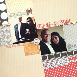
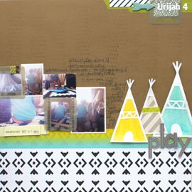
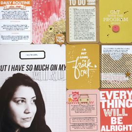
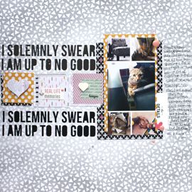
I'm back with the newest challenges from Ch{all}enges Masters! You have until the end of the month to complete as many challenges as you like :) And this week's challenges are just as good as last's! You can click on the challenge name and it will take you directly to that challenge over on Ch{all}ange Masters. Or you can click the the challenger's name and either visit their profile or blog.
 Ad Challenge by Mary Jane
Last month, I received a JoAnn's ad in the mail that I thought would be perfect inspiration for some paper crafting. I wanted to use the shapes and colors on my own project and thought maybe everyone else would be able to find their own inspiration in this ad.
For this month’s ch{all}enge I want you to do a layout or card where you make your own embellishments and borders with decorative edges. You should be able to do this with scissors, punches, or die cutting machines. The only requirement is they must be your own, not purchased.
The color combo for this month: lime green/orange/aqua/purple. You may add a neutral as well: white/black/cream/brown but I'd love to see the colors listed as your main colors used.
This week I want you to scour your KITCHEN. Go in there, take a look in the cupboard, fridge, etc. and see what you can find that you can recycle and use on your page or cards. You'll be surprised at what you can find :)
My hybrid challenge for the month of July is to print onto something other than plain paper. In my example layout, I layered masking tape over my background paper and printed directly onto that. I think it has a really awesome texture and effect. I love that you can still see bits of the patterned paper vaguely underneath.
You can vary this challenge plenty of ways. You can print journaling, titles, digi elements onto transparencies, envelopes, brown paper bags, recycled packaging, canvas. Skies the limit!
Do you have special drinks that you usually only have in the summer time? Show me a layout with your favorite liquid summertime refreshment! Mine just happens to be my fav alcoholic beverages, but it doesn't have to be.
Here is your challenge for this month:
1 Butterfly
2 Photos
3 Papers (can be a mix of patterned and cardstock)
4-5 flowers
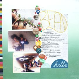
Additionally – I want you to think outside of the traditional journaling box and do something different with your journaling (put it in a shape, make it hidden with a pullout tag, make a pocket for it, whatever you can come up with!).
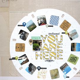
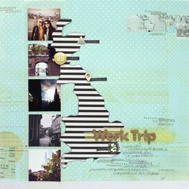
One of my favorite techniques is to crop several smaller images and fit them into the space allowed for one photo. The images don't have to be the same size, you can vary them as you need. And, they don't even have to be all of the same event or time frame. In fact, the pictures I used in my example were taken randomly over the period of more than a year. But, there are a couple of guidelines to follow to make it work.
1. No matter how many photos you use, they need to fit into the rectangle shape you're working with. Meaning, they all need to line up around the outside edges. It's okay if they have to overlap somehow 'inside' the edges ... but, you're going to want them to appear as one photo that has a straight top, bottom and sides.
2. I find it's visually appealing if you have one photo that is dominant. Dominant can mean that it's larger than the others or perhaps it's in color and your other 'supporting' photos are black and white. This isn't a hard and fast rule ... but, it's good design to create a focal point, and that's true in this instance, too.
3. Mat your grouped photos. Having them all on a photo mat will make them appear as a single element. It will reinforce the appearance of a single photo in your page design.
- Each submission must be a newly created project specifically for the challenge.
- Only one entry per category.
- Challenges may be combined, but each submission is one entry no matter how many challenges are entered.
- Each submission must be uploaded to the proper folder in our gallery no later than 11:59PM ET on July 31, 2010 to be eligible for the random draw.
- Each submission must follow ALL requirements of the challenge to be eligible for the random draw. For example, if the challenge states blue must be used, then there must be some blue in the project in order to qualify.
So there you have July's Week 2 Challenges! Click on each challenge title to get ALL the details, as I simplified for the post a bit. Be sure to stop by and take a gander at all that's going on with the Divas! And perhaps participate in a challenge or two :) Happy Scrapping!
xxbesos
j.leija

 I crafted Tara's birthday present again this year. She's received so many handmade gifts, I have to get creative with her presents these days! This year, I altered a set of Moleskine notebooks for her. She's also the most driven person I've ever met and for some reason that bulls eye paper reinforced that idea to me. Plus, can't beat the navy, red and yellow color scheme!