Showing posts with label Cambodia. Show all posts

Top 12 of 2012

Monday, December 31, 2012

Hello friends! And happy almost New Year! Blogging today as I'm coming back from the dead. I caught a virus a few days before Christmas and am still suffering from it. It's frustrating, because all I've wanted to do with my days off is run errands and clean house, but I haven't had much energy for either of those things. I'm hoping to start feeling better soon though. Especially as my sweet boyfriend planned a lovely NYE dinner out and about.

I had a fairly productive year in scrapbooking terms. I made 120 layouts and 90 cards, 2 mini books and 6 altered art pieces. Not bad for a crazy busy year.

But seeing as we're at the end of 2012, I wanted to share my 12 favorite layouts from the year. Here are some stats on them:

There are five 12x12 layouts and seven 8 1/2 x 11. 
One is from Lisbon. 
One is from Bangkok. 
One is from Cambodia. 
One is from Japan. 
Three are for Urijah's album. 
Two feature Sketchbook sketches. 
Two are scraplifts.
Five instagram shots were used.
Seven were made using Studio Calico kits.
Matt made it into three.
Paint and mist were used on five layout each.
I stamped on nearly all of them.
But surprisingly washi was used on just a few.

I love each and every one of these, most especially because of their vibrant colors. This is my life, these are my loves =)

Without further adieu and in no particular order. Here are my 12 favorite layouts of 2012:


And that's all folks! Until next year, I hope you all have a sparkling night full of light and love.

cheers & besos,

Angkor Wat

Saturday, May 26, 2012

I got my enlarged prints! And can share the first page of the 2 page scraplift with you. I went super simple, even more simple than Celine's original creation. This enlarged photo did all the work for me.


I have to say, even though I wasn't in love with 35mm, I still managed to make good use of it. 6 pages, 2 cards, you just can't beat that.


Mind you, this is with the Main Kit only. I didn't purchase any of the add-ons. That in and of itself was a bit of a challenge. I did have to supplement with my own letter stickers, some tags and a bit of twine here and there. But otherwise, the kit got me through. I might have had to do with the bit of planning I did beforehand. Any way you cut it, I'm happy with my pages and have several more to add to my book!

cheers & besos,


Southern Gate

Wednesday, May 23, 2012

So I think I'll not be doing green & blue layouts again any time soon. 35mm is officially put to rest. But I have to show you 2 more pages I made with the kit. It's a double page layout! Although not a very traditional one, as one page is 8 1/2 x 11 and the other is 12 x 12. ...and they don't really match match. But they're from the same place! So let's just pretend it's a true double page, deal? ;)


I figured something out while using these hexagons. While I love the look, I find them so hard to work with! I literally had to force myself to use this paper. And it was just a happy accident that the leftover piece I had was exactly 8 1/2 in. wide with the cute little border strip.

Layering was my method for tackling the hexagons. It made them more "star" like for some reason and stars I can work with.


The second half of this page was inspired by a old Sketch Wednesday prompt from Celine's blog. Loved the look of 4 vertical 4x6s. I brought the hexas along on this page as well, using 2 different patterned papers.


This tag is one of those happy accidents. I thought I'd spray it yellow but then it just made the already tan tag even more tan. Then I sprayed with a more sunshiny yellow and that just looked a hot mess. So I hit it with brown which looked ok but adding a last layer of gray over top sealed the deal. I love all of the color depth. It was vaguely reminiscent of the mossy surfaces of the statues themselves.


This day is one I won't ever forget. Traveling with your best friend, what more can one ask for? We couldn't resist taking silly photos with these various serious statues.


And here's the 2 pages side by side.

I love mixing it up and included both 8 1/2 x 11 and 12 x 12 in the same album. Do you do this too? I went extreme in Urijah's Year 1 album with the above sizes as well as 8x8 & 6x6. Check it out here.


cheers & besos,

Bayon

Tuesday, May 22, 2012

I call scraplift! It's ok, when I'm telling you upfront & not trying to submit my pages for submission to magazines =) 

This gorgeous creation of Celine's was begging to be scraplifted. The big picture she used was what drew me in and this photo of the temple was so detailed it needed to be enlarged.

Used the 35mm kit + the new Studio Calico Abroad collection, some paint, stamps, and wood veneer, but shrunk it down to 8 1/2 x 11. It makes it look magazine-ish to me and I love that!  


cheers & besos,

Temple

Monday, May 14, 2012

Celine Navarro you are a design genius! There, I said it. I love this lady's style & the funky graphic edge she adds to every page. Plus she travels! A ton. And goes EVERYWHERE! Like seriously, I want her life. But enough of my gushing. Go check out her work, it more than speaks for its' self.

This was one of my inspired by pages that I talked about yesterday. I based my layout off of her India 2012: My top 5 layout. I figured that little flipbook would work perfectly for all of the photos I took at Angkor Wat in Cambodia.

I did my best to make the most of those tiny pages, but small canvases are just not my jam. Each "layout" had it's one challenges and I tried to make them cohesive but also random and varied at the same time. Here's where having the same color scheme and one that works well with your photos really helps!! 


cheers & besos,

Kit Flow: Seeking Inspiration

Sunday, May 13, 2012

My May SC kit arrived! All shiny and new in it's lovely kraft pizza box. So I thought I'd share one of my processes for making layouts with these lovely things.


As you can imagine each kit has it's own theme & color scheme. 35mm was all blue, green, cream and brown. There's a bit of red and yellow in there, but just small pieces. There were some hexagons & one of the new flip books Heidi Swapp released this season. It's a nice kit with good bones, but not one of my absolute favorites. Which is what makes using it a fun challenge!


When my kits arrive I label them and put them in these jumbo hefty bags. It's the best way I've found to keep everything together and to be able to quickly see which kit is which.


It shouldn't be a secret by now that color is the driving force behind my pages. I'm an absolute color fiend. I start by searching for photos from my ever increasing catalogue with colors that will work with the kit. 

For this one I reached far back into my coffers and dug out some travel photos from 2008. There were a few places that I thought would work well with these products.

Like possibly Cambodia...


Or maybe Berlin...


I might even dig into some Ireland photos.


Notice the theme? All of the photos have a heavy blue/green influence. Funnily enough I'm even wearing the same t-shirt in a few.

Once I had some photos pulled, I went hunting around for inspiration. It's not something I usually do, but like I mentioned before this kit isn't one of my favorites, so I needed an extra push to form some ideas.

Celine's layouts were most inspiring for me. So I made sketches of a few and picked photos that I thought would work. Here are the layouts I drew some inspiration from: India 2012-My Top 5, First time in India, and Love Life & Life will Love you Back.


I ordered some enlarged prints via Persnickety Prints and am waiting for them to arrive. In the meantime, I made a few pages with regular and tiny prints that I'll be sharing throughout the week.

I also finished up all of my Sketchbook 4 layouts. Here I am mapping out where the photos will go. Those are my silly crude images of each the photos. Doing this helps me figure out the sizes I need to print them at and how I need to cut them down. My Epson PictureMate makes printing these tiny guys a breeze (link is to the newest model).


That's one way I approach using all of these kits I have piled around. Be sure to keep checking back to see how the pages turned out!

Also, this wasn't my usual blog post but I hope it's something you find useful. Please let me know if you're interested in reading more about this type of thing. I'm always interested in sharing "best practice". And if you buy kits, I'd also love to know how you approach using yours!

cheers & besos,

Asian Agenda

Monday, May 10, 2010

Just wanted to update with a sampling of my latest design team work for Handmade Love and Scrapbook Challenges. Since I'm such a frenetic scrapbooker, we're now back in Asia. These are all fairly basic layouts, simple lines, cardstock bases, minimal embellishments. Not my typical style but I'm happy with them none the less. And even more happy that I'm slowly whittling away at the mountains of photos I have from the past few years!


xxbesos
j.leija

Portrait of Asia

Wednesday, March 24, 2010


Ah, the self portrait, the most basic of all photos. It's wandering (no pun intended) and illusive. For me at least. I'm not one to turn the camera on myself when I'm by myself so they rarely come about. But here are a few chance photos, I've recently felt compelled to scrap.

The Story:
I was walking the streets of Hong Kong, up and down the mighty hills, drenched in sweat and ready for a break when I passed this random metal column. It was huge, oversize and most importantly, reflective. I loved all of the scuff marks on it, and how they've made my photo looked distressed. It's a glimpse of what was going on around me during that particular time on that particular day and that's what I love about it.

The Page:
For this layout, I used a sketch from the Studio Calico blog and some new Jenni Bowlin product. Then rounded it out with some gold Maya Mist, a lovely Kraft envelope and one of those too cute chipboard butterflies.


The Story:
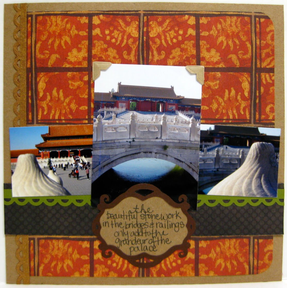
These photos, this trip, that country, all have such a special place in my heart. China was the first place I ever travelled to on my own and thankfully I felt totally embraced by the country and its people. Even getting stopped by locals who, I think, didn't realize I wasn't Chinese. And I was totally blown away by the city of Beijing. The Forbidden Palace was such an amazing place to visit. And so huge! I didn't spend too much time in any one area and it still took me almost 3 hours to make it from one end to the other. Time definitely well spent.

The Page:
For this layout, I used an older sketch from Sketchy Thursday and some older Basic Grey product. I LOVE the grey/orange color scheme. It's one of my faves but I don't get to use it very often. And I've had those fabulous wood grain alphas in my stash for awhile, they blended in so perfectly with the rest of the layout and are now my favorite part!


The Story:
If you're ever planning to travel through Southeast Asia, you have to stop off in Cambodia. Not only does it house a marvelous archeological gem at Angkor Wat, it's also just an all around laid back country. I'll never forget the trip from Bangkok to Siem Riep. It was a whole day on a bus and then a cab. Sounds horrible, yeah? But we actually sort of enjoyed it. It was interesting to see how people's days ended when the sun went down, how there are still places without electricity and paved roads. That isn't all of Cambodia by any means, and we stayed in a very lovely hostel by the river, but it does make you appreciate life in the West so much more. Another interesting tidbit about the country, they operate on US Dollar. After 16 months living outside of the US, it was so surreal to walk up to an ATM in Cambodia and see $dollars spit out.

The Page:
This is an all out scraplift from a newly discovered Pea, walesk. I loved the minimalist look of her Early Spring layout and the bright colors she used. I really wanted to emphasize all of the colors in the photo and I think I achieved it with the mix of Dear Lizzy, Sassafras, and Studio Calico paper. Added the buttons for a bit of dimension on an otherwise flat layout. It's one of my latest faves!

xxbesos
j.leija