And thus the countdown to the New Year begins!
2012 is knocking at the door, it's just that hard to believe.
The older I get the more apt the phrase "time flies" becomes.
And as the new year looms, I can't help but reflect on the past year and all of it's accomplishments. But more on that later.
Most importantly, here is a recap of my favorite layouts from the year, in no particular order:
I think what I like best is the colors and the title and the fun circle elements. And that I didn't really like the kit I used to make this page, but after having created this page, I liked the kit! Go figure. Also super proud that I used those unattractive orange Thickers. Or was it just fate that I was wearing orange that day...
(2) 2008
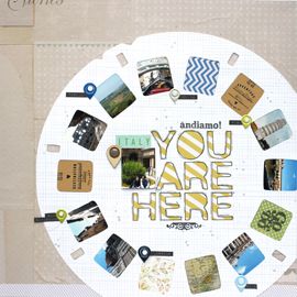
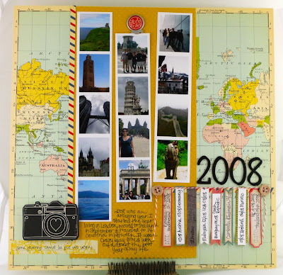 This put into perspective for me, just how much traveling I actually did that year. 16 countries! I always love highlight pages and I especially love all of my photos from this year. I keep going back to them again and again.
(3) Hagia Sofia
 And you would probably never guess that this page and the one above were both created from the same sketch, just tweaked a bit. Again, I love how the product so subtly reflects the images.
 This was one of those happy unplanned accidents. I had no concept or idea of how I was going to do this page. I just reached for a stack of patterned paper, found one that fit (and rather perfectly at that) the photo and embellished accordingly. I also liked that I scrapbooked a photo that I would not normally have got around to scrapping.
 Playing with mist and doilies was one of my favorite techniques this year. And combining it with my favorite color yellow made it that much more beautiful.

I don't know if it's just the place that I love, but there's something about this scrapbook page and how all of the elements work together so harmoniously. How the images are reflected in the design. This is how I like my scrapbook pages!
(4) Topkapi Palace
 And you would probably never guess that this page and the one above were both created from the same sketch, just tweaked a bit. Again, I love how the product so subtly reflects the images.
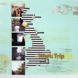
(5) Wrinkle in Time
 There's a lot of symbolism in this page. The clocks, the crumpled (wrinkled ;) background cardstock, the crowns. I like whenever one thing references everything else. I also simply adore the subject manner. London has my heart.
 There's a lot of symbolism in this page. The clocks, the crumpled (wrinkled ;) background cardstock, the crowns. I like whenever one thing references everything else. I also simply adore the subject manner. London has my heart.
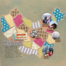
(6) China
 This was a fun layout to make! And I got to create with Amy Tangerine's line, a favorite of mine. I also liked the circle photos and getting to see on one page all of the Chinese cities I visited.
 This was a fun layout to make! And I got to create with Amy Tangerine's line, a favorite of mine. I also liked the circle photos and getting to see on one page all of the Chinese cities I visited.
(7) Sitara Place
 This was one of those happy unplanned accidents. I had no concept or idea of how I was going to do this page. I just reached for a stack of patterned paper, found one that fit (and rather perfectly at that) the photo and embellished accordingly. I also liked that I scrapbooked a photo that I would not normally have got around to scrapping.
(8) CKC, KP & SC
 This page is 100% about ephemera. Oh and meeting some super sweet scrapbookers who also happen to be some of the most famous ones out there :)
 This page is 100% about ephemera. Oh and meeting some super sweet scrapbookers who also happen to be some of the most famous ones out there :)
(9) Me & My Bright Ideas
 I like this page. I like the light-bulb details, the colors and most importantly that sheet of Crate Paper (purely gorg). But mainly I like the subject matter. It's all about my love for travel, even if it means traveling by myself. And how, 100% of the time there this one moment, it's usually only a few seconds, when I'm seriously asking myself, "what the heck were you thinking?!"
 I like this page. I like the light-bulb details, the colors and most importantly that sheet of Crate Paper (purely gorg). But mainly I like the subject matter. It's all about my love for travel, even if it means traveling by myself. And how, 100% of the time there this one moment, it's usually only a few seconds, when I'm seriously asking myself, "what the heck were you thinking?!"
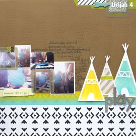
Whenever I journal on Urijah's pages, I always write to him and I rarely right out "y-o-u". I usually replace it with just a "U" which is handy since it's his initial. So when I found some inspiration in the form of a Dr. Seuss quote that included this handy moniker, I couldn't not use it. That, combined with the American Crafts Chap line makes it my most favorite Urijah page of 2011!
(11) Just Bee-cause Card
 Playing with mist and doilies was one of my favorite techniques this year. And combining it with my favorite color yellow made it that much more beautiful.
And that's that. Despite my extremely busy year, I still managed to create 100+ layouts and 80+ cards. 11 of which I shared today.
If you're a scrapbooker and are doing a similar blog post, please link it up in the comments. I <3 seeing everyone's favorite layouts. Here's to more scrapping in the coming year!
xxbesos



No Comments Yet, Leave Yours!