Morning yall! I'm soooo tired! I've been running on all cylinders for what seems like quite awhile now. Busiest time at work right now and I'm still studying for that huge exam. Needless to say, I'm beat. But this exam is nearly over so I'll have my weekends back after this one. Wah hoo!!
But this morning I wanted to share a few more Little Black Dress kit pages.
Sound good?
Ok!
I managed some Christmas layouts with the "Don't Worry Be Happy" kit! Well they're Christmas layouts of sorts. Christmas adjacent if you will. The photos were taken during Christmas but you can't actually see the Christmas tree right next to the chair. So instead of focusing on the fact that these are holiday photos, I decided to de-Christmas-fy them and just use my pretty kit :)
These pages are 8 1/2 x 11 (obvs) because Urijah's 2-3 year scrapbook is that size. I wanted a challenge! And it has been interesting working everything to this size. But for his 4-5 year scrapbook, I think I'll go back to good old 12x12.
Anyway, on to the pages...
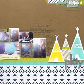
This was my take on the black cardstock challenge. I wanted just the slightest black edge to help define this page. And then I had fun playing around with a primary color scheme, especially since the photos are fairly neutral in color.
I used my Silhouette (this month's LBD) to cut the title (Fonts: Deftone Stylus & Arial Black) and after that just added some flags and my journaling. This came together so quickly and I love that I got to share this story.
This page is the last kit layout I put together. It came together so unexpectedly well too! I knew I wanted to have the photos tilt across the page like that. I knew I wanted there to be strips of patterned paper above and below. But the checker board came to me on the day and I think it makes the whole page!
I also want to point out the title! I die cut it out of black cardstock (Font: Bebas Neue) and then painted an ombre effect on it. I just free handed it with gray and the white paint. It added the perfect touch to distinguish the letters from the background.
Oh and the background is the B side to the My Mind’s Eye Lost & Found 3 “Ruby” Red Floral Paper. It's cream with a red design and then I smothered it in red mist. You can subtly see the design in real life but not so much in this photo.
And the pictures! I nearly forgot to mention them. I'm getting better at this whole Photoshop Elements thing guys! Well really, I'm getting better at goggling for and watching videos about how to do cool new things. I had fun converting these photos to black and white and then bringing Urijah and his bike back in color. The backgrounds were just too distracting and I'm happy to have de-emphasized them.




No Comments Yet, Leave Yours!