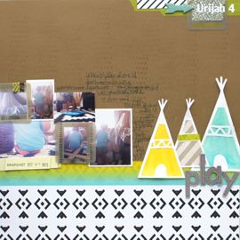
Hi there! I'm so excited to share this double page layout with you. Because come on, look at that sweet little face =) He's getting to be such a big boy and this terrifies me. Stop getting older little one!
I LOVE how this spread turned out. LOVE! I created the left side using the arsenal of techniques I picked up from the Toolbox class. It was for the Pinterest Challenge Shanna issued and is directly inspired by these two pins: [
Pin1] [
Pin2]
[PHOTO]
A messy crafty watercolor-y feel was what I was going for, and I think its so awesome that you can achieve this digitally without making a total mess!
[PHOTO]
I just couldn't not enlarge this sweet photo of him. It's not the best image, it's a bit blurry and the photo quality isn't the greatest. As a quick fix, I just did a quick screen grab of a video I shot of him. He was jumping on the bed and laughing his head off at me.
[PHOTO]
I dug into my Elle's Studio Cameron collection which was so perfect for this photo. Glad his mama picked out that shirt for him to wear! The colors couldn't have worked better!
[PHOTO]
I embellished with some cork circles and glittery stars. Plus since my printer didn't really pick up the green very well, I added some actual green ink splatters and a vellum circle sticker.
[PHOTO]
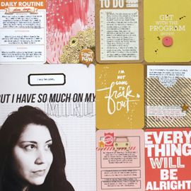
I loved both of these die cuts because they used the word "you" which is how I personalize all of my journaling to him. I always write it "u" since his name is Urijah. I covered them both up with thickers and added my journaling about this boy and his latest milestones. He's doing so awesome!



No Comments Yet, Leave Yours!