I’m part of the design team, but believe me, this doesn’t diminish my excitement about Spark’s monthly release even a bit. I love looking through and see what everyone else came up with and reading Jennifer’s always helpful opening article. This month’s is about shopping and oh man, even though I’ve been doing this thing called scrapbooking for so long, I still learned something new.
Here’s a page I put together featuring one of this month’s sketches. It’s actually a really simple page once you break it down. But since the event itself is formal, I dressed it up by doing two things:
1) I used black cardstock as the base. I think this might be the least used color in terms of layout backgrounds. It definitely changes the feel of the page. Since this event happens at night and is considered black tie, I thought it would be the perfect backdrop for these photos. The colors just pop off of it!
2) I added metallics. I kind of went crazy with them! Using my Silhouette, I cut out the stars from the black cardstock and backed them with this great silver glitter paper. I also dropped some Heidi Swapp Color Shine in Silver. Lastly, I used some funky shiny sequins left over from a Studio Calico kit, as accents.
Stars were a big part of this design, mainly because they feature in the room decor. You can kind of see them in the ’14 photo, behind my colleague’s head. Seeing them every year always makes me excited, so I wanted to replicate that by using stars on the background, in the patterned paper and with the embellishments.
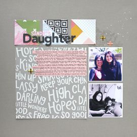
This page, along with a recent favorite layout, are featured in the April edition of Spark Magazine. Head over to Simple Scrapper for more info. I’m super pumped because tomorrow is the beginning of one of our quarterly events, Refresh. I’m ready to sit down, figure out my plan for the next 3 months, organize, recharge and get crafty.



No Comments Yet, Leave Yours!