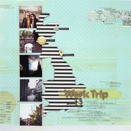
For this page, I had a lot to say about my 10 year anniversary with the city of London. Enough to fill an entire 8 1/2 x 11 sheet. But there was no way it was going to look pretty anywhere on my nearly completed page. Which is why I opted to add a tab to the top of the sheet and make a pocket on the back of my page!
The layout is based off a sketch from the Simple Scrapper membership (Sketch No. 293 for all of my SS ladies!) I loved all of the March 2016 sketches so much! I made two pages using them, this and the Adult Today layout I shared at the beginning of the month. I loved that the sketch called for blocks of patterned paper, my favorite scrapbook supply! These are three sheets from way deep in my stash: 7 Gypsies (top), October Afternoon (middle) and Basic Grey (bottom). I could have put this design on a white sheet of cardstock and would have been totally happy. But I thought I’d switch it up and instead used this bluish gray. After all, London is typically pretty gray. I think it makes the photos and the paper pop more.
Red was my accent color. But I used it sparingly. It was at the top of that 3x4 journaling card (by Ali Edwards) so I matted it behind my photo. Then I stamped a red bus and added two triangle enamel shapes.
Aside from the overall design and the photos and the story, I think my most favorite part of this page is the tiny timeline I included as the “journaling”. It’s such a great way to show a relationship over time!
cheers & besos,
cheers & besos,




LOVE this idea! I typically do 2 page spreads, where one side is the photo(s) where I can get crafty and creative, and the other side is a block of journaling, with a bit of decoration to tie the two together, but I will be adding this technique to my repertoire. :) Thanks for the great idea!
ReplyDeleteThanks Nicole! I'll have to look at your blog for inspiration :)
Delete