Choosing photos continued...
Last week I walked through how I choose photos to print. This week, I wanted to share what actually made it on the page. Apologies in advance for the wonky colors!!
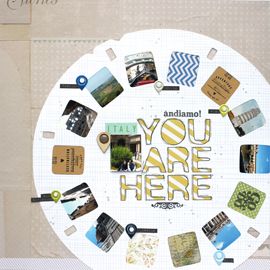
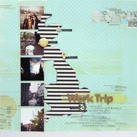
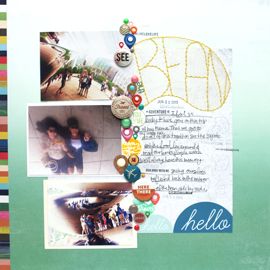
I took 10 photos in Pisa and only printed 6. Of those 6 only 5 made it onto the page. The photo with my favorite composition got left off, mainly because it was horizontally oriented. If I do a re-cap or summary page, I'll more than likely include it there. So I'm not bummed that it didn't make it onto the page. And later, if it really bothers me, I'll just go back and make another Pisa page :) Simple as that.
Used my new Studio Calico So Cal kit for these photos, the main kit only. (I really wished they'd photograph the B side of the papers as well, I had no idea we'd get some green!) The colors work so well with the images. I'm happy with my choice to scrapbook Italy this month :) It's only been 4 years!! My Mama was like "Still?" after I told her I was scrapbooking Italy. Seriously woman, you have no idea...
This double page layout was inspired by the Double Take class Nic Howard & May Flaum just finished teaching at Big Picture Classes. I'll do a review of the class a bit later, once I've gone through the prompts a bit more.
Journaling Reads:
"We started our Italian adventure by flying into Pisa. It was the best introduction to Italy. As soon as we got off the plane there was no mistaking we were somewhere new. Italy transports you. Driving into the city, we got our first glimpse of the Tower over the orange & yellow buildings.
The Tower was huge and yup, just to confirm, it's definitely leaning. We decided not to brave the stairs but of course paused to take pictures. Thanks Mom & Pop, for bringing me on your anniversary trip! I had fun playing tour guide."
Get ready for more Italy pics! The fun has just started :)
cheers & besos,




No Comments Yet, Leave Yours!