How have I not been doing this all along?!?! I really can't tell you how much I'm loving this project. In 2011 I did Project 12 and I loved the album. (You might have seen my title page, it was everywhere when I posted it) But it was some work to put it together and to remember the dates and to find more calendar papers and a whole host of other excuses.
I decided that I wanted to try to tackle it again. But this time using all of these great Project Life goodies everyone is making these days. I could never be a "real"Project Lifer. Weekly spreads sound like sooo much work to me. So this is my adaption of the project.
Handbook sized pages.
Covering a full month.
As many pages as it takes.
Mostly divided page protectors.
Using mainly a kit (this was Studio Calico Marks & Co).
Black and white photos plus a few in color.
And that's really it.
Have a scroll through the pages below. I made 15 of them for the month. Not really sure if that's a lot or a little. I made a few notes about some of them, but they're mostly straight forward. I have to admit, those little pockets were so intimidating to me! But I think I figured it out.
I already scrapped this for his album, so happy it's now in mine! Just love his sweet smiling face. "Smile" diecut is from the Toolbox printables.
This is one of my favorite pages! I loved the sequins in the kit and I loved it even more in the little glassine bag it came in. I knew it wasn't enough to make a full on pocket so I decided to strategically glue the sequins down on the cardstock. I had a time of it, trying to stitch the vellum to the cardstock, but that's just something I need to work out with my sewing machine (we're frenemies).The die cut is from the Toolbox Class as well.
And here is my favorite page for the month. I had so much fun sewing these awesome fabrics down. Mercifully, my sewing machine cooperated at this point.
I was directly inspired by the bonus class Corrie Jones did for Wilna's Art Class. The colors were inspired by one of the great PL cards in the Marks & Co kit, but I didn't end up using the card.
Oh, and here's the point in the post when I plug the hell out of these Kal Barteski for SC stamps. I literally bought the kit for those stamps. And all of the fun goodies were just a bonus.
Here's my unsolicited opinion about handwriting in scrapbook pages. DO IT! Your kids will totally appreciate seeing your handwriting! There's nothing I recognize more instantaneously, than my mother's hand writing. Just seeing it makes me feel like I'm home.
Mama sent me some scrapbook goodies she picked up at Ross and included a quick hand written note with them. I saved it, even before I thought to start this project. I love it that much. I ended up just stapling some ribbon to the top and slipping it in between two of the pages in the page protector. Simples!
Oh yeah, my nickname is Chubs....
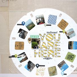
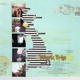
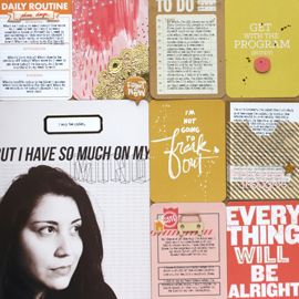
This photo pairing might be my favorite. I love the colorful square with the smaller "photo strip". Plus Lauren is darn cute in these! App for the rainbow effect: Snapster. Photo editor: PicTapGo.Loved the sentiment "you are here". It has so many more meanings, than simply where one might be standing in a photo. I used it metaphorically on this spreadie. I'm at the point in my career where its time to find a new job. The hunt has begun!
And this is too special to not talk about. Quick run down: I painted bright circles onto cardstock. Printed my photo onto vellum and glued it over top. Embellishing was so so simple, just a label, mist splatters and some enamel dots.
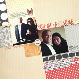
I think I'm most in love with the simple text printed directly with the photo. It makes me literally LOL whenever I read it because I can hear Eric's incredulous voice in my head.
I love that this not so awesome full on flash photo, turned into something I heart hard.
And that's it! For month one at least. I'm taking this project as it goes, I've decided. This will in no way take the place of my layouts. Because I love them so much! But it will help me scrap some of those smaller stories I don't think would fit into a full dedicated page.
As far as going back in time. I'm thinking I'll try to get the summer months done. But other than that, full size layouts from that time period will have to suffice.
What do you think of my first attempt at the whole Project Life phenom? Those small pockets weren't the death of me after all! I've tried the whole divided page protector thing before and never felt like I got it together. For whatever reason, something clicked in my head this time around and I actually enjoyed the process!! Took me a day and a half, but again, so happy with how it turned out!
cheers & besos,



No Comments Yet, Leave Yours!