Did you know that XXX is not a symbol for promiscuity and debauchery, but actually an old world trade symbol for the city of Amsterdam?
Or so I'm told...
Back in the day, freight bound for Amsterdam was for some reason or other, tagged with an XXX. And because of Amsterdam's red light "reputation" it then became the symbol for all that aforementioned promiscuity...
Just a random tidbit (that I haven't actually googled to verify) to initiate this post on Amsterdam pages :)
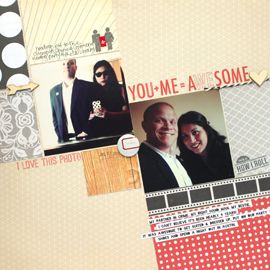
Here's my favorite photo from Amsterdam.
 It's of my two besties, Christian & Kori. It was a cold and rainy November, when we visited A-dam. So when we weren't trying to see the city, we'd duck into a bar to wait out the rain. Which was actually awesome, considering we'd only met the month before and were still getting to know each other.
I love that the bartender got the stained glass in the background.
And that it has Amsterdam on the bottom!
 As far as the page, the details are what does it for me. I discovered that I had a windmill stamp stamp (hehe!) in a variety pack from Tattered Angels.
 So the layout was based almost to the T, on an older Sunday Sketch from Studio Calico. I thought it was perfect for my red light theme!
 Also to emphasize the circles, I used my bubble stamp to add some texture to an otherwise plain sheet of paper. I cut out two larger circles and backed them with some of my favorite red paper scraps. And added a random assortment of brads and buttons for texture and depth.
 I think the reflection of the lights on the water are what makes this photo. It would definitely be missing something without it.
 As far as the page, the details are what does it for me. I discovered that I had a windmill stamp stamp (hehe!) in a variety pack from Tattered Angels.
And I had been saving this cool bottle cap from a few months back, that went perfectly with the green in this page.
Oh, and I forgot to add that this is a Sketchbook 3 sketch! Day 7 or is it 12? I think...I'll need to look it up. But that's definitely 14 layouts from the class now :)
And now to the infamous red light district...
Dum, dum dum....
This is the only photo I took. And to be honest, we didn't spend too much time there.
There's not much going down on the street. You'd have to walk into the places and being in a big group of girls, we weren't really down to do that.
It's still a beautiful spot.
All of Amsterdam is really!
 So the layout was based almost to the T, on an older Sunday Sketch from Studio Calico. I thought it was perfect for my red light theme!
 Also to emphasize the circles, I used my bubble stamp to add some texture to an otherwise plain sheet of paper. I cut out two larger circles and backed them with some of my favorite red paper scraps. And added a random assortment of brads and buttons for texture and depth.
 I think the reflection of the lights on the water are what makes this photo. It would definitely be missing something without it.
So there you have my not so sordid adventures in Amsterdam. Still a few photos form this trip left to scrap. Check back soon for more!




No Comments Yet, Leave Yours!