

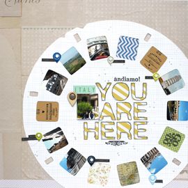
Color! If anyone really knows me, they know I'm a girl of color. I love bright colors, soft colors, earth tones, bold tones, basically just everything across the spectrum. Which is what makes these two layouts a few of my favorites.
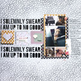
I turned to my February issue of Creating Keepsakes for inspiration on this one. A layout done by Maggie Holmes really jumped out at me, so I viciously scraplifted it. I once again utilized my Maya Mists in order to achieve a graffiti effect, added a few different style of Thickers for the title, and a few strips of patterned paper and other various embellishments. This graphic look is a total departure from my usual style but I'm happy with the results.

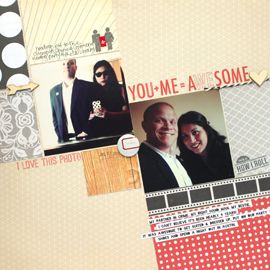
I've been hoarding this awesome American Crafts patterned paper as well as the idea of incorporating Ingrid Michaelson's "Be Ok" song into a layout. I combined the two in yet another layout about Matt and my's long distance relationship (or LDR as Kate calls 'em) All of the color was picked up from the strip of quotation marks. If you think of a bold pack of Crayola markers, this layout features the majority of those colors. Which is what makes this layout so fun!
I find it aptly appropriate that I'm watching my favorite HGTV show, Color Splash with David Bromstead, as I type this blog post. Love his bright bold rooms and ingenious use of color! Me and David, we're color siblings we are. Love him!
My question for you, what's your favorite color?
xxbesos
j.leija

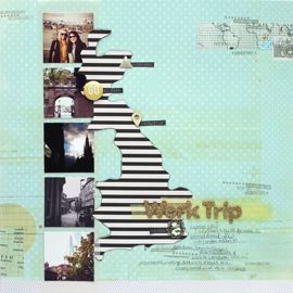
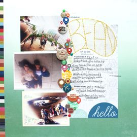
I LOVE the Berlin graffiti page. The misting is fabulous and I love the pictures. I love your page about long distance relationships. Mine isn't as far as yours and it's half the distance of what it used to be, but I really appreciate this page!
ReplyDelete