Thanks Camp Scrap for getting pumped to scrapbook this summer! I went digging through my photo box to see what photos I wanted to use.
These were two 4x6's that I knew I wanted to scrapbook.
I loved this sheet from Crate Paper and thought it brought out the best colors in the photos and also added in some great accent colors as well. It's how I pulled in the different colored scraps that I stamped those ellies on.
I dug into a whole slue of new goodies that just arrived with my last (for the next few months!) Two Peas order. Like those great Crate Paper plastic alphas. I also think it's the first time I've ever used that Amy Tangerine stamp set. For shame!
But seriously, this is one of the biggest reasons why I decide to stop buying new product. It really forces me to use what I have.
I also initially decided that I wanted to write my journaling directly on the photo. But it turned out horrible! Not to worry, re-printing took only a few minutes and my problems were solved. But as I was going back through my files to find this photo in particular, I realized there were so many more photos I wanted to include.
Hence this second page:
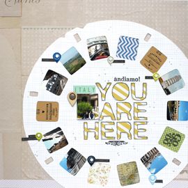
I pulled a whole smatter of photos and cropped them into 2x2 in squares, knowing I wanted to create a grid layout. I also pulled out my Acorn Avenue 6x6 paper pad and some scraps of that great kraft Elle's Studio polka dot.
To decorate some of the squares I used my new Travel Girl stamps (LOVE THESE!!!) and that line's die cut pack. I also busted into the Simple Stories brad pack and added one of those fun cork medallions. I opened up a lot of new packages for this page and I love that.
The cardstock background is this amazing-in-person gray orange peel texture. When I saw it in the store I immediately thought, it looks like elephant skin!! So I definitely wanted to use it here. It cools down the whole page & that's ok. I'm just really glad that patterned paper sheet I decided on in the first place included some gray as well.
Since I didn't like how the journaling on my photo looked, I decided I wanted to add an insert page but with a twist!
I've had this idea to print a photo onto a full 12x12 sheet of vellum for awhile now. I'm so glad I did it! It's how I decided to incorporate the journaling and was a fun "technique". The photo wasn't that great of quality and the printing not exactly perfect, but I love the look and feel of it so much!
So here's how my loose double pager looks next to each other. I pulled a lot of the same elements onto both pages and made sure to repeat the patterned paper and tape on both, as well as the little stamped ellies.
And here's the vellum page with the next page peeking under it. I think it looks awesome!!
Wow, that turned into a big share! And I think that's perfectly ok.
But seriously yall, this is why I'm so excited about Camp Scrap! For me, it's been about just working on projects & getting my stories told. I can use any supplies I have and any photos that I want. This doesn't look like anything May has shared and everything goes! I'm quickly realizing, that's my kind of class =) So check it out if you have the chance. Registration closes on the 12th.
cheers & besos,



Wonderful layouts. I really love the way the vellum printed photo turned out. I definitely need to try that!
ReplyDelete