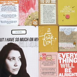
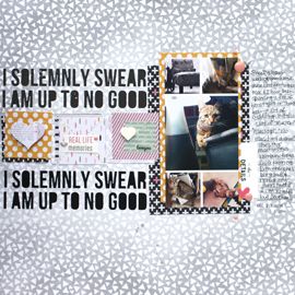
You'd think I'd be tired of them by now, but indeed I am not. If you read my blog, I'm sure by now you've discovered how much I appreciate a good sketch. Sketches have got me through many a page, and they're the first place I go when I'm in need of a bit of inspiration. Here are two recent layouts, created with the use of a sketch. Both are from the ever inspiring Sketchy Thursdays Challenge Blog.
Each sketch is open to a variety of interpretation, which is what makes them so versatile. You can add or subtract as much or as little as you want. You can rotate, flip, or mirror it any way you like. I suppose this is why they appeal to me, I can take an initial idea and run with it. Plus, when sketches incorporate elements I don't typically work with, such as circles, it really helps me to push my scrapbooking further than its gone before.
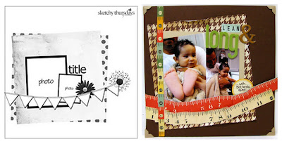
This layout very clearly mimics but does not necessarily copy the original. I layered a sheet of cardstock, on top of a piece of patterned paper just the same as in the sketch. Then I started playing around with an element or two. The pennant banner in sketch became a ruffled, rumpled ruler on the bottom of my page. The title, which was more than 5 characters, took a longer more meandering space towards the top. And the 2 circular elements was combined into 1 for space. I also added that multi-colored strip on the left to give it more balance.
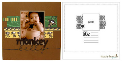
Isn't this the cutest picture? Urijah looks so adorable in his little monkey pjs. His belly is all plump and round. Which is what inspired the title as well as the theme. I've had this great monkey paper sitting in Urijah's box of goodies (I seriously have an entire box full of stuff just for Urijah's scrapbook. It's a problem, I know!) for awhile now. I've always been a bit intimidated by it, because of its busy patterned. But combining it, with the Sketchy Thursday sketch really made for a perfect match.
Since the sketch had only touches of what I interpreted to be strips of patterned paper (it could also easily have been ribbon or decorative tape) it allowed me to highlight the patterned paper, without overpowering this too cute photo. I didn't have much in the way of journaling for this one, but by using a larger size font for the title, it filled in that space. I also wanted to give the page a bit more balance, which is why I extended "belly" across the bottom of the page.
So that's my little PSA on the benefits of scrapping with sketches. There are tons of sources for free sketches available across the web. Some of my personal favorites are, of course, Sketchy Thursday which offers a new sketch every Thursday. The Studio Calico blog, where every Sunday a new sketch is released. You have a week to create a layout, based on their sketch, for the chance to win a $5 SC gift certificate. Another good place is Pencil Lines. I'm fairly new to this blog but I'm liking what I've seen so far.
In closing I challenge you, fellow scrapbooker, to create a layout based on a sketch. Especially if you haven't already. You might just find yourself addicted! Happy Scrapping :)
xxbesos
j.leija


Love all the sketches you've been doing lately! I save sketches and then never get around to going back and actually using them. Your pages are amazing and I'm also loving the new blog look! do that yourself??!!
ReplyDeleteI agree with Christy. I to collect sketches and then never use them. I should as I haven't done a layout since my Dec. Daily album.
ReplyDeleteLove your take on your sketches.