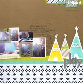
I will admit. I am utterly and complety smitten by a 14 month old real life baby doll. My nephew Urijah, has me wrapped so tightly around his little finger, its practically turning blue! I adore this little creature and thus he has become one of my biggest sources of inspiration. Sometimes it's hard to get in the scrappy mood, as we all know, but for some reason I can always scrap Urijah pics. Which is why all of my other albums suffer and Urijah's continue to grow. But that's ok, I don't mind spending hours on end staring at his cherubic little face, with its chubby cheeks and only 1 adorable dimple. I cherish any photos I have of him, because we don't get to see him nearly half as much as we'd like.
It's kind of crazy how we all clamor for news and photos of him. My parents will ask me nearly daily if his mama has sent me anything new to look at. Just yesterday, Christin sent me some photos of him feeding himself spahetti. Now if you have tiny children, have had, or even been around one you know how messy they get when they eat. That's literally compounded when you consider spaghetti! But in the photos he's happy as a clam, food everywhere and a big smile on his face. I can't wait to get around to scrapping them. But even as tired as they were, having just drove in 2.5 hours from the beach, at 11 pm they were still ready to see pics of their grandson. [Note: as I was typing this, I just received an e-mail from my mother demanding spaghetti pics!]
I do a lot of this scrappy stuff for me, but I love how much of it benefits the rest of my family as well. I have a totally captive audience, anytime I pass along pages of Urijah to share. We're all under his spell and equally his prisoners of love! And thus we get onto the theme of this post and of my new favorite layouts!

I'm writing about these out of order, because I thought up the second layout first. But as ideas kept spinning around and ricocheting off the walls of my brain, I thought a Wanted poster would be a great introduction for the second (yet first) page. Matt was kind enough to find some inspiration for me, as I called him from my 3.5 hour commutte. (I drive back and forth between SA and Houston a lot and I get a lot of ideas as I'm roaming the sacred halls of I-10.) Matt's usually the first person I call when I'm excited about a page. Poor man, I'm sure he could care less but he still listens to me all the same. So Matt found me a wanted poster as inspiration. He wanted to make sure that he got credit for "his idea". Umm…no! You didn't make the poster, you just found it homeboy! And I had the original idea to create one, so there! :P
But anyway, I created this layout exclusively in Word, using only Text boxes and playing around with character spacing and font size. I dropped in the photos and added lines in between the text. Then I printed it on Kraft cardstock and distressed the edges before mounting it on black cardstock. I wanted it to have a rougher, old timey feel. Printing directly onto Kraft definitely achieved that.

And now on to the kicker. The Line-up. :) I got the idea for this page on that same drive from Houston to SA, just after I'd left Archiver's with some of the new Basic Grey Oliver line. I love these little creatures! They're the perfect products for little boy pages. And the colors are awesome as well. Primary but also bold, not bright and in your face which I appreciate. And the whole idea came about due to one little product, those Woolies.
Manufacturers do an awesome job packaging products together to make them more appealing to consumers. And better still all the products coordinate. I find myself drawn to great products and also realize that a lot of what I like is all the products together as a whole. So I've been doing that more, keeping packaged products together and using them all on my page. I just recently did that on the Mueso Chillida page; all of those ribbons were in one package from Making Memories. I also did it in my long distance love page, clustering an entire package of Vintage Buttons (also Making Memories) in nearly identical order to their packaging. Heck, I even went one step further and incorporated the package design into my page.
So I was driving back to San Antonio, thinking about my new scrappy purchases and trying to figure how to use those beyond gorgeous felt creatures when the idea of a line up came to me. I have no idea why or how, it just did. And it was so simple to bring to life. A few strips of black patterned paper, black number stickers, the Woolies and some Thickers. Viola! Practically everything on that page is from the package of Woolies and I think I only left one of them, a button, out. I really lucked into that photo also, so happy he was wearing red!
Can you see why he's absolutely adored? Why we love him so much and miss him even more?! Hate to be the gushing Auntie but I hope you'll forgive me just this once. Happy Scrapping!
xxbesos
j.leija


Cutest layouts ever! And that "Lineup" one - oh my goodness! It's amazing!
ReplyDelete